CIRCLE, SQUARE, TRIANGLE THEORY
In Feature Films and Television Shows
by Teretha G. Houston
INTRODUCTION
Great visual storytellers know how to get under the audiences’ skin without the audience members knowing how they did it. The application of the circle, square, triangle theory in feature films and TV shows is one of the methods creators have used to do that since the invention of film and TV. It is a way collaborators of film and TV hack into people’s emotions using the audiences’ own psychological predispositions to make those emotional connections easier and faster.
The circle, square, triangle theory hypothesizes that different shapes induce different emotions and feelings. The theory is based on psychology and has been supported by various psychological tests. The basic shapes are circle, square, and triangle. These three shapes are the most easily recognized and the most easily distinguishable. When most shapes are reduced to a silhouette, they will fall into one of these three, although not perfectly in many cases. For instance, a profile of a Volkswagen Beatle can be reduced to the shape of a circle, the Hummer SUV can be reduced to the shape of a square, and a Porsche Cayman can be reduced to the shape of a triangle.
As for designing for movies and TV, these shapes are not rigidly restrictive. Under the umbrella of the circle, oblongs and curves are included. For squares, rectangles are included. For triangles, sharp angles are included. Therefore, Freddy Krueger’s right hand was designed using the triangle—his left hand was not.
The application of the theory is a design tool, but in no means is it a law. Although the circle, square, triangle theory can be seen as banal or can be said to play up stereotypes, the majority of movies that sit atop the world’s biggest box office lists and TV shows that have had stellar ratings have employed this tool.
THE CIRCLE
The circle is the most benign of the three basic shapes in the theory. It is often used in designing characters who are jovial, innocent, childlike, non-threatening, or who is the comic relief person in the story. Places and things that are designed based on the shape of a circle generally connote comfort, peace, or neutrality.
It is not uncommon to see overweight, round shaped people carry the comedic side of the story. The characters are generally made up of circles and soft curves.

Elmo from the television show Sesame Street is a good example of a character that has been designed based on the circle. His head is one soft, round circle, and within that head are big round eyes and an oblong nose. Even his mouth is a half circle. His body and fingers are made up of soft curves and rounded edges, all features of a character that has been drawn on the shape of a circle.
THE SQUARE
The square is often used to design characters who are the heroes and to design places and things that are strong and safe. Superheroes are often basically squares. They tend to have strong, square jaw lines. Superman is an example of a heroic character who is designed based on the square.
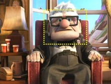
In the Pixar animated movie Up, Carl Fredricksen, is a grumpy, senescent man who just wants to leave society and go on the adventure he and his recently departed wife had dreamed about since they were kids. Now that she is dead, Fredricksen, who is voiced by Ed Asner, is determined to go on that adventure for the both of them. A little boy named Russell tags along, unbeknownst to Fredricksen.
The character Fredricksen is drawn on the shape of the square, subtly giving away the fact that by the end of the story, he will be the hero, although in this case a reluctant hero. Fredricksen has a square face, and his eyeglasses are made up of two squares. His chair is square, and his floor mat is rectangular, which are sharply contrasted against his wife’s round chair and round footstool sitting right next to him.
In the end, Fredricksen saves Russell, a pack of talking dogs, and the only known birds of a particular species from his antagonist Charles Muntz.
THE TRIANGLE
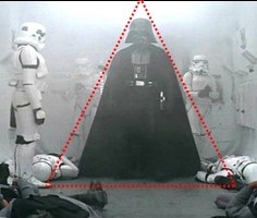
The triangle is often used in designing characters who are villains and places and things that are menacing, scary, or terrifying. The triangle connotes danger with its sharp corners that warn against getting too close because of the possibility of getting poked or jabbed.
Psychological studies have shown that most people’s pulse rates were higher when shown a picture of a knife than they were when shown a picture of a gun. Their pulse rates were also higher when shown a picture of a blade with a larger angle, like a butcher knife, than they were when shown a picture of a blade with a smaller angle, like a sword.
Darth Vader, from Star Wars, is essentially a large triangle. His mouth is a triangle, and so are his cheek bones, his cape, and his helmet.
CIRCLE, SQUARE, TRIANGLE THEORY APPLIED WITHIN ONE MOVIE
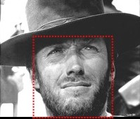
In the movie The Good, the Bad and the Ugly, Blondie, played by Clint Eastwood, is the hero of the movie. Eastwood has a strong square jaw line, perfect for the role of a hero. To add to the heroic composition of Eastwood’s facial features, the character Blondie often wears a cloak that also makes him appear more analogous to the shape of a square.
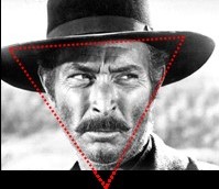
Sentenza /Angel Eye, played by Lee Van Cleef is the villain. Van Cleef was a staple in the movie industry until his death, known for his work playing villains. It is easy to see why he would be ideal to play a villain if the circle, square, triangle theory was used in casting. Van Cleef has a very angular jaw line, and his nose is also very angular with downward slanting nostrils and a tip that almost comes to a point.
Tuco, played by Eli Wallach, is the comic relief character. Wallach has an oval shaped face and a round, bulbous nose. To round out his circular design, Tuco wears a big, round sombrero that makes his face appear even more round.

CIRCLE, SQUARE, TRIANGLE THEORY APPLIED TO SAME CHARACTER TYPE IN TWO DIFFERENT MOVIES
The movies E.T.: The Extra-Terrestrial and Independence Day both have aliens as dominant characters. However, there are great differences in how the two are designed. The friendly E.T. is designed on the shape of a circle, while the planet-destroying aliens in Independence Day are designed on the triangle.
E.T. has an oval head, big round eyes, a round stubby nose, and a round pudgy abdomen. Looking at his head from a high angle, it takes on more of a triangle shape, but even from this angle, his head still has round, soft curves, and no sharp angles like a triangle. His head comes to a rounded shape on the back instead of coming to a point. These curved features still adhere to the theory.
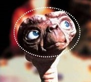
E.T. has no harmful intent. Having been left on earth accidentally by his kind, he has only one goal—“Home.” He uses the bulbous tip of his finger to point in the direction of his home.
On the other hand, the aliens in the movie Independence Day are out to kill every living human on planet earth.
The circle, square, triangle theory was used in designing the aliens in both the biomechanical suit, the aliens’ outer shell, and the inner aliens themselves.
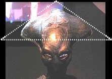
Later in tanks at Area 51, the entire bodies of three aliens are shown, which are dominated by sharp angles. In the operating room, the alien lies on the table, still inside its biomechanical suit. Its entire head is shown, and the triangle shape steeples to a sharp point at the top. The suit opens vertically to reveal the alien inside, which also has a triangle-shaped head and a triangle-shaped, sharp protrusion coming out of its abdomen.
From the first time an alien creature is shown, it is established as a dangerous villain whose predominant shape is the triangle. The alien’s biomechanical suit has a large, triangle-shaped head.
When the alien stands upright, it looks like one triangle (the alien’s head) inside a bigger triangle (the biomechanical suit). The hands start to move, revealing that even the tips of its fingers are triangular.
Patrick Tatopoulos, the aliens’ designer, opted for the triangle shape instead of the more traditional rounded depiction of aliens, given that circular shapes create a more non-threatening connotation. Alien creatures which say, “I come in peace” are generally more round and pudgy. The menacing ones in Independence Day, however, come to take over the world, and their bodies are designed to connote the feeling of impending danger.
So when the alien in the operating room says, “Peace? No Peace,” his body design has already given that away.
CIRCLE, SQUARE, TRIANGLE THEORY APPLIED TO SAME CHARACTER TYPE WITHIN ONE MOVIE
In the movie The Lion King, both of the characters, Simba and Scar, are lions, however their designs are very dissimilar. The differences in their design help to analyze two characters—one the hero and the other the villain—who belong to the same species or who have generally the same physical makeup.
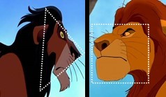
Simba, the hero, is designed on the shape of a square. His strong, jaw line and the hair that frames his face are in the shape of a square.
The evil, scheming, murderous villain Scar is designed on the shape of a triangle with his sharp, triangular nose and his angular eyes. Even the joints in his legs and shoulders are angular. Sharp angles jut out menacingly from almost every spot on his body.
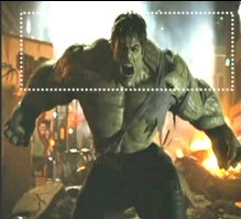
Another example of how the circle, square, triangle can be applied differently to two different characters who have generally the same physical makeup and are within the same visual story is the movie the Incredible Hulk. The good character, The Incredible Hulk, and the bad character, the Abomination, are both built on basically the same chassis. They are both big, muscular characters, however the difference is in the details.
The Hulk has a square shaped head, and his shoulders are squared by a horizontal line that stretches from the top of one shoulder to the top of the other.
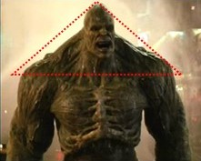
The Abomination has distinctive triangle features, one of the most prominent being the shape of his muscles that run from his head to his shoulders. Unlike the Hulk, the Abomination’s muscles in this area run diagonally from his head to his shoulders, creating a prominent triangle. The Hulk’s neck muscles, although well defined in the same area, are far less of a triangle than the Abomination’s.
Adding to the Abomination’s design, is the row of triangle-shaped plates jutting out of the back of his head and running down the length of his spine.
The Abomination’s nose is sharp and angular, and his teeth are jagged triangles, whereas the Hulk’s teeth are straight and rectangular. The Abomination’s elbows have triangle-shaped protrusions, which he uses to stab the Hulk in the chest, and his knees have triangle-shaped plates covering them, but the Hulk has neither. The Abominations calves have triangle-shaped protrusions that stab through his skin and look like the broken bones of compound fractures.
CIRCLE, SQUARE, TRIANGLE THEORY APPLIED TO CHARACTERS WHO GO THROUGH A METAMORPHASIS DURING THE STORY
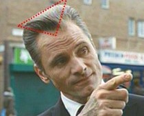
At the beginning of the movie Eastern Promises, the character Nikolai’s hair is based on the triangle shape because at that time the filmmakers want the audience to view him as a bad guy, a hardcore member of the Russian mafia. The front hair line of Nikolai, played by Viggo Mortensen, has a triangle shape that dips downward in the middle and narrows to a point at the center of his forehead.
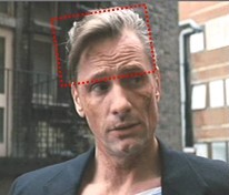
Later, Nikolai is revealed as an undercover cop who is really a good guy. He is so far undercover, he has to use a dead body to file a progress report with his department. His hair is then changed to the square—the front hair line no longer has the triangle, but now has a straight line with a section of hair draping over the right side of Nikolai’s head, which squares the shape of the hair.
Another example of a character who undergoes a metamorphosis during the movie and in which that internal change is mirrored externally is in the movie Aliens.
Ellen Ripley’s overall shape is adapted throughout the movie to conform to the different stages she goes through as she is transformed from a dormant character to a hero. The shape of the hair and wardrobe changes as Ripley, played by Sigourney Weaver, changes.
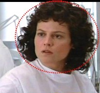
At the beginning of the movie, director James Cameron, who has a strong artistic background and therefore knows about designing to yield a desired effect, first introduces Ripley via a circle design to depict her as more of a neutral character. Her hair is rounded, and her white hospital garb is rounded with soft, curved edges. At this point in the story, Ripley has yet to take up the role of heroine. She is simply a survivor with no intent to do battle with the aliens or anyone else. She is the antithesis of a heroine at this point: she is the one who has just been rescued.
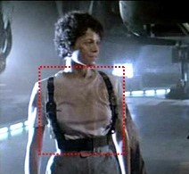
Later in the movie, Ripley must shift from neutral into the heroic mode. That inward change is shown outwardly in her wardrobe. At the very instant Ripley is transformed into a fighter, Cameron has her shed the top of her gray suit and replace it with a weapons holster that looks like suspenders, which gives her upper body that squared look of a hero.
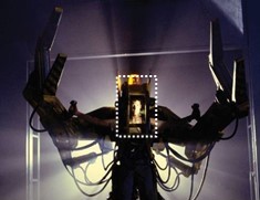
Even later in the movie, Ripley must shift into an even higher gear of heroism when she must battle a giant alien in hand-to-hand combat in a fight to the death of one of them—or both of them. Again, Cameron shows that internal revving up with a corresponding revving up of the external wear. Ripley gets inside an iron power loader that is one square upon another square all built into one giant square. Ripley’s face is inside the rectangular face shield, the claw grips are square, the feet of the loader are square, and the overall shape of the loader is a giant rectangle. Ripley is standing inside a rectangular opening to display the heroic role she is forced to take in order to save herself and the little girl nicknamed Newt.
Ripley’s new transformation is also introduced to the audience using a square motif. This new version of her is first seen as square doors of a service elevator open and she steps through a square entranceway. The boarders of this entranceway are well lit so the audience can easily see its square shape.
James Cameron expertly has Ripley’s heroic change in attire linked to the story. Rather than simply have her change her attire for no reason, Cameron makes her changes vital for her survival. The most effective circle, square, triangle transformations within a movie or TV show are seamlessly integrated into the story and serve an important purpose within the story itself.
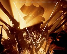
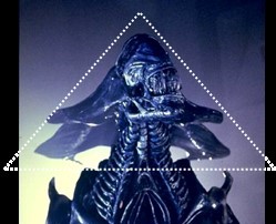
The alien creatures, on the other hand, do not undergo any character transformations. They are blood-starved villains built on the triangle shape in the beginning. They are blood-starved villains built on the triangle shape in the end. From every visual angle, they are made up of triangles and sharp points. They have triangle shaped heads and long tails that end in an ominously sharp triangle that is akin to that of a butcher knife.
MASTERPEACE IN THE APPLICATION OF THE CIRCLE, SQUARE, TRIANGLE THEORY
The Lord of the Rings Trilogy
Circle, square, triangle theory is not limited to characters, their hair, and their wardrobe. It can be applied to anything the audience can visually perceive. Lighting and set design are among the other ways the theory can be applied to enhance the audiences’ experience, and both are expertly applied in The Lord of the Rings trilogy.
The Lord of the Rings trilogy is complex and has a fitting application of the circle, square, triangle theory not only in the characters, their hair, and their wardrobe, but in the lighting, the set design, set decorations, set location selection, props, and make-up. This trilogy is complex in another way as well. The characters and the places are often a mixture of traits. A safe haven can turn into a death trap in an instant, for example. The design of these characters and places are equally visually complex in this trilogy.
SET DESIGN
Circle Set Design
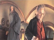
A set that is designed based on the shape of a circle can depict a setting that is non-threatening or one that is peaceful.
The Hobbits’ round home with its great sweeping curved archways and entrances, its circular windows, its circular window shutters, and its circular doors is designed on the circle motif in The Lord of the Rings trilogy. This is a home that reflects the innocence of its childlike owner Frodo.
Square Set Design
A set designed using a square motif can depict a place of structure, order, and security.
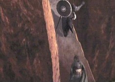
The heroic band of characters who are trapped in the lethal underground world of Moria must get out before they are killed, and their only way out is to flee across a bridge. This only safe passage is also the only surface in this deadly land that is drawn on the shape of a square.
Triangle Set Design
A set that is designed based on the shape of a triangle can indicate a place that is dangerous, chaotic, and inhospitable.
The heroic band of characters trapped in Moria come to a point where they are tenuously standing on two separate triangles. There is imminent danger all around them, compounded with the fact that there is very little terra firma. The pernicious orcs, terrifying beasts who have sharp angles infesting their bodies everywhere, are shooting arrows from above them. A balrog, a demon of the ancient world, is closing in from behind them. The place is collapsing around them. And the very stones they walk on are collapsing beneath them.
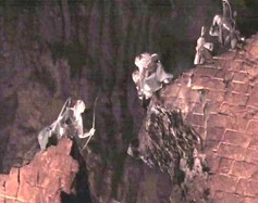
This danger is accentuated visually by the triangle set design. Every step they take and every turn they make is an angle or a sharp point. The set is replete with triangles. In the foreground, midground, and background are triangles and uninviting edges.
LIGHTING
Circle Lighting Design
Lighting is often used to throw round soft shapes of light or to create round soft shadows around an innocent or comical character.
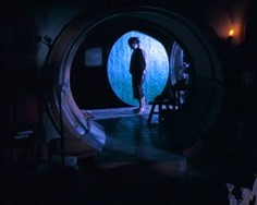
The door at Frodo’s home depicts a circular lighting design. This is an example of reflective lighting where light is bounced off an object, in this case a door, to create the desired amount of luminance.
Frodo is a peaceful and benevolent character, and the circular lighting design at his home is one of the ways the filmmakers demonstrate that.
Square Lighting Design
Just as lighting is used to reflect the inner makeup of an innocent or comical character, it is also used to produce squared lighting or create squared shadows to externally represent a heroic character or a place that has orderly structure or one that provides security.
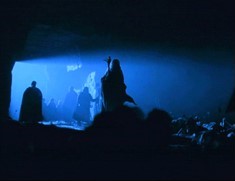
The entranceway to the underground world of Moria has rectangular lighting, promising security and order, which is what the characters, especially Gimli the dwarf, believe it to be. But this is just the entrance.
Triangle Lighting Design
Lighting is often designed to throw angular shapes of light or to create angular spaces of darkness on a villainous character to reflect his or her inner makeup or to indicate a dangerous place.
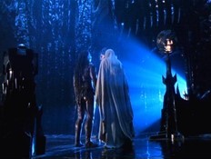
The lair of the evil villain Saruman is given a triangle lighting design, which would indicate this is a dangerous place. This triangle lighting illuminates an uninviting domain, befitting such an inhospitable character.
CONCLUSION
From the beginning of movies and TV, those who make them have applied the circle, square, triangle theory in making decisions about everything the audience can visually perceive. Deciding upon a general shape is done based on what the collaborators want the audience to feel, to think, or to believe at that particular time in the story.
Some of the greatest visual storytellers of all times have used this technique to create some of the biggest box office movies of all times and some of the highest rated TV shows of all times.